Kindling
Kindling is a collection of printed decor fabrics that aims to spark ideas and satisfy designers looking for creative, contemporary elements to play with.
Way back in 2006 or so took some textile printings courses while doing my MFA in visual art. I liked the idea that the final work could end up in a living space rather than a gallery space. And I liked the fact that my final product - a roll of fabric - wasn't so final. It would be passed on to someone who could have a completely different point of view and idea about how to use it. I still like that idea of creating something to be passed on. I created these fabrics because I want to see what others - specifically interior designers might do with them.
The room and the way it makes you feel when textures, colour, materials, lighting are brought together - that is the domain of the interior designer. My goal is to create patterns and fabrics that excite and inspire designers in their work. Perhaps one of these fabrics will be the jumping off point or perhaps the cherry on top. For me personally I get satisfaction from drawing and developing a pattens that have a look that I have never seen before on fabric; patterns that have an innate energy of their own that won't fade with time. The designs are ready but their journey has just begun.

Tumble
In the background there’s a big bold dot and layered on top are plant-like tendrils cupping together to form round shapes that remind me of a tumbleweed.


Smatte
This pattern comes in 3 colour-ways. Small scale with a lot of contrast and energy. But it can still sit in the background and play a supporting role for a larger print. This is one of those patterns that came from just drawing that same motif over and over again - killing time waiting for inspiration to come. Trying to get the perfect motif then noticing there’s not one single motif that looks good on its own but as an army they sing. - each one imperfectly off tune in it’s own way.


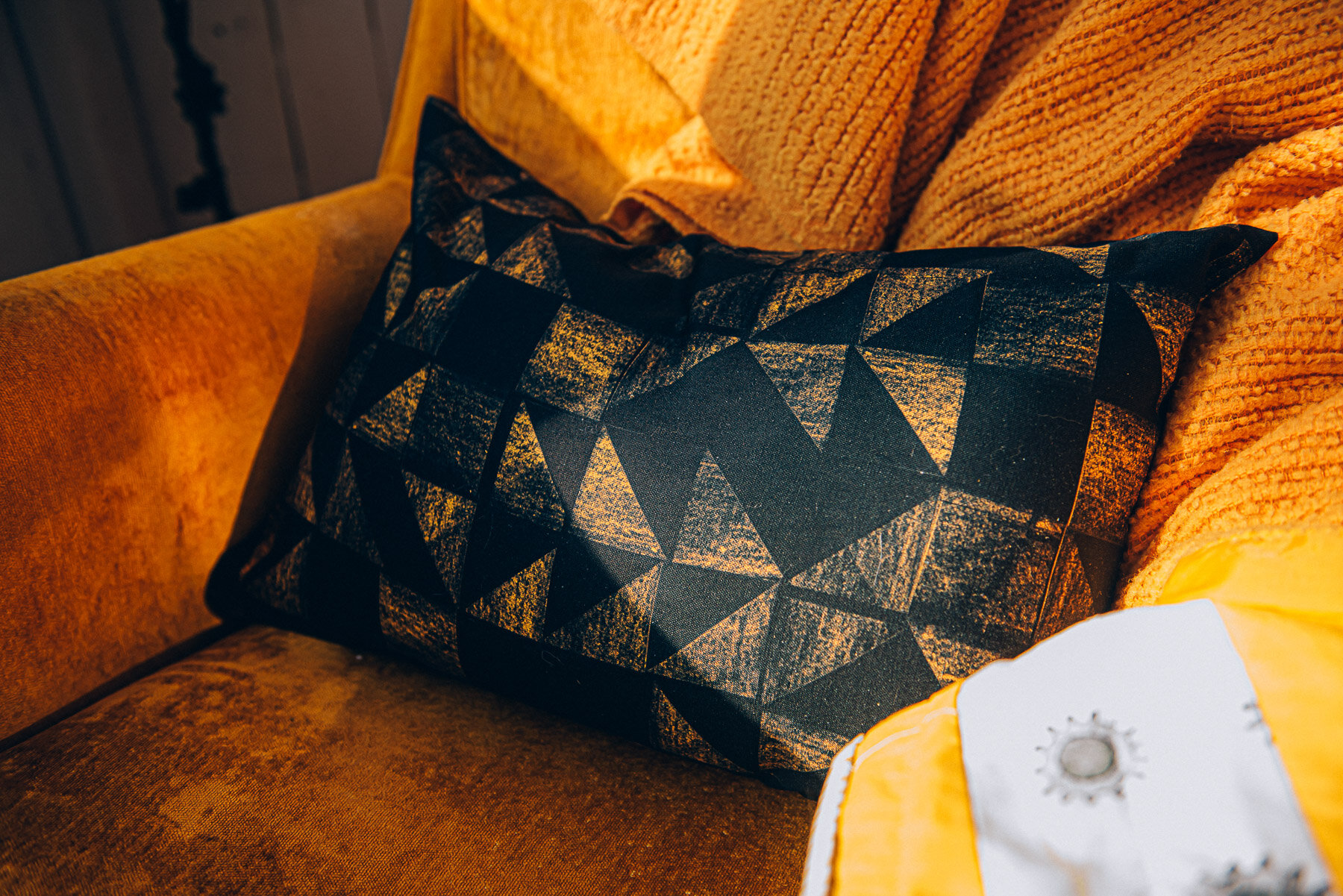
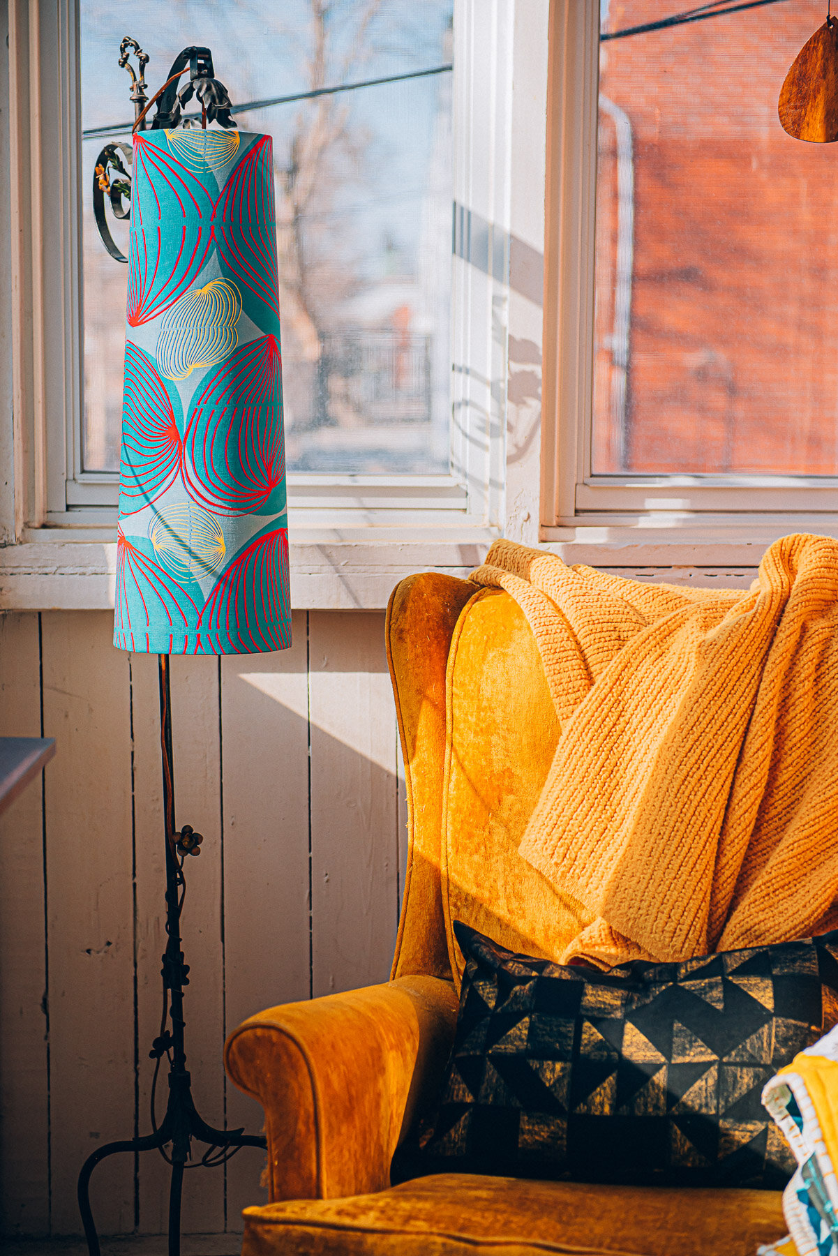
Tile
Based on some floor tiles I saw in a church once. The checker floor had been repaired with the square tiles cut in half and replaced with 2 triangles, disrupting the pattern in an unintentional but good way. I did the same thing with cut out shapes. The charcoal texture reproduces so well in digital - the layered colours on deep black to me feel so textured and cozy - somehow masculine too.


Dose & Flint & Smudge
3 patterns with a marine feel.
Dose is blue droplets all lined up in rows on a natural white ground. 2021 is the year of droplets and doses I suppose. It’s a simple pattern.
Flint is a stripe - made up of hand drawn stone shapes. It has a nautical feel too. They look a bit like rope floats; the kind you use to mark out swimming lanes.
Smudge is a pattern of smudged charcoal marks on paper translated to fabric in inky indigo tones. It’s leaning into purple though right? I know this pattern will work perfectly somewhere. But purples are tough for me to visualize in decor. I hereby put this fabric out there as a challenge.


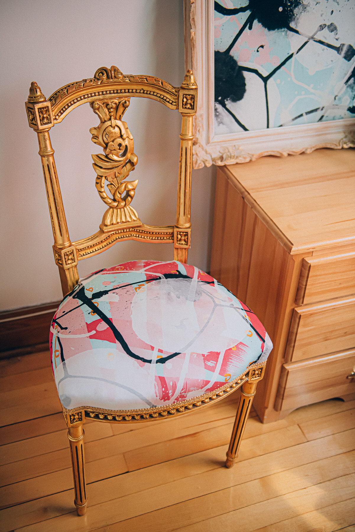
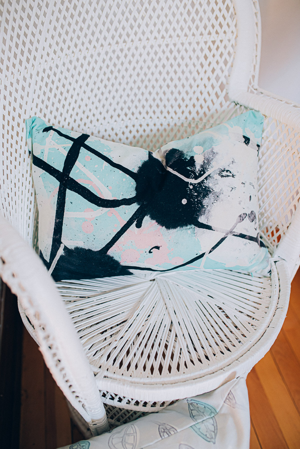
Fritz, Swim & Suss
Big abstracts - Built up from ink drawings - layered digitally.
Fritz - Gumball is pink and fun - with a black streak.
Swim - Forest & Swim - Cream feel wet - like a specimen under the microscope.
And Suss - Mint - is just suss with its black tendrils invading what was a friendly mint cream and pink party.


Swell
I love a meandering swirl. But this one has some nice angles giving it a hard geometric edge too. Looking lovely in 2 colour-ways - mint on black and mint on white. The scale seems just right for an accent chair.


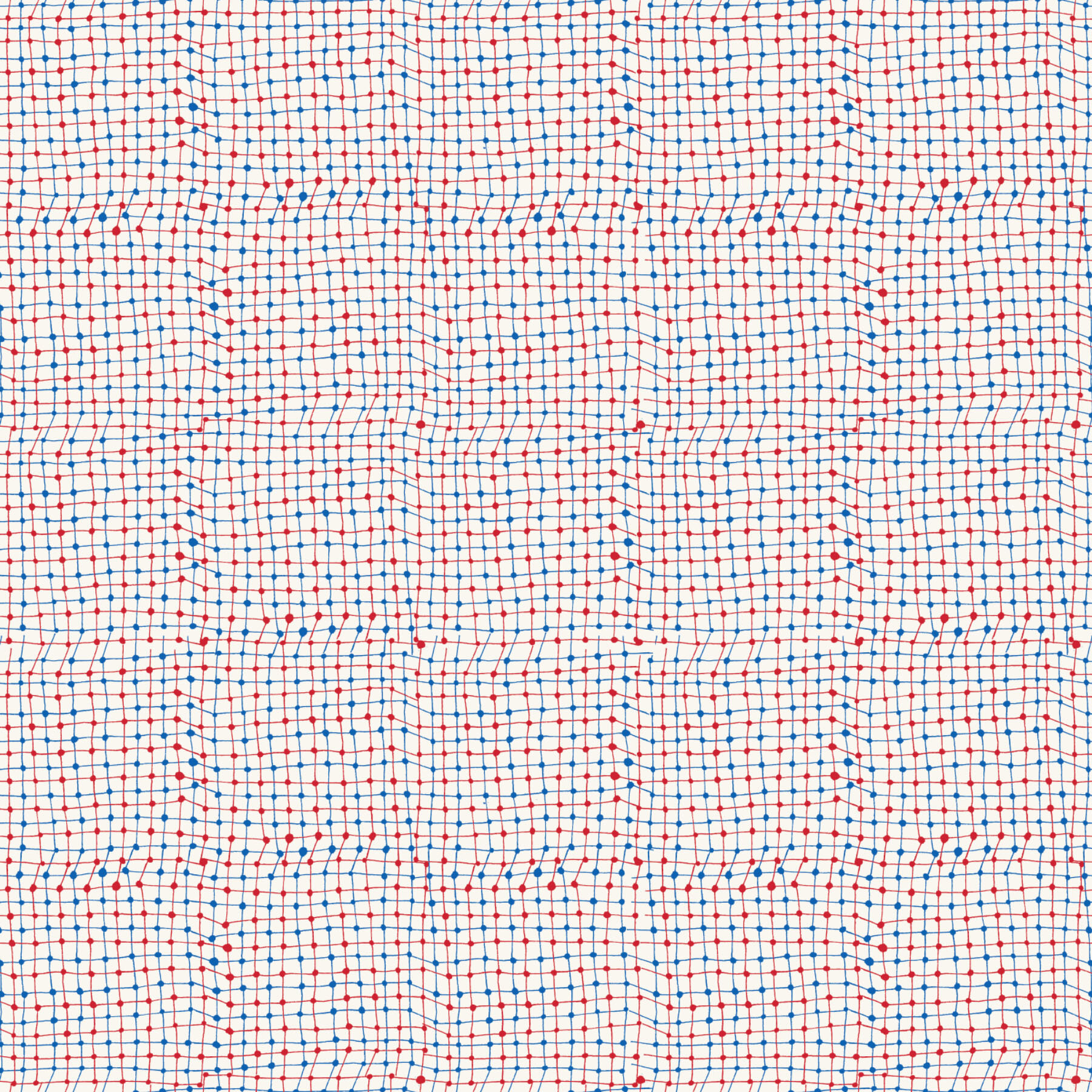
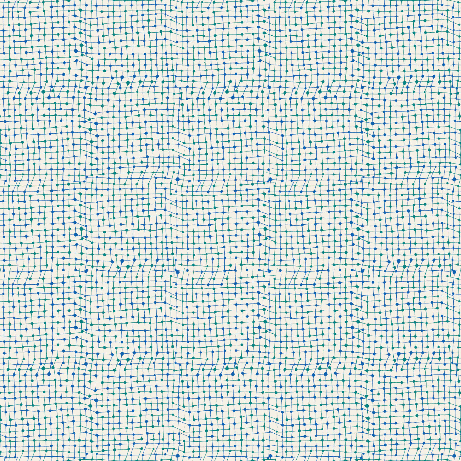
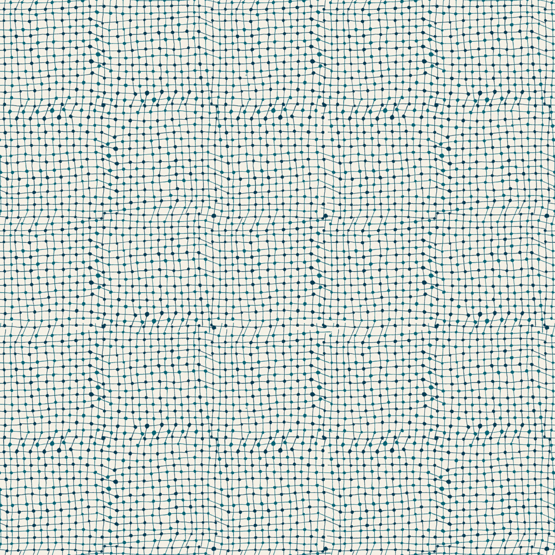
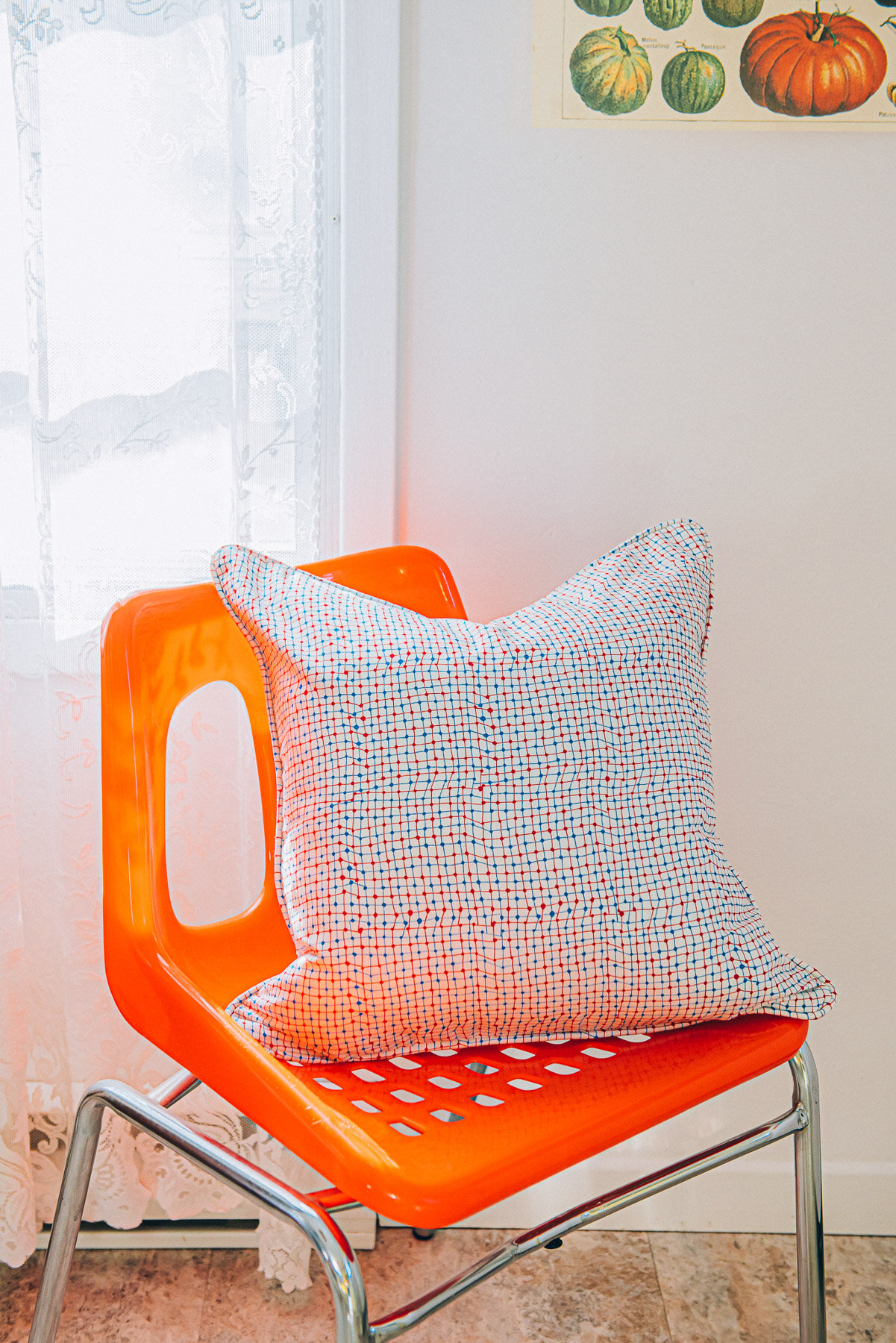
Trapeze
Trapeze is a net like pattern with many imperfections. The criss crossing colours trick the eye - red and blue lines give off a purple aura from a distance.